DIY Varsity Letter Art

The book I've been collaborating on over the past few months has to do, in part, with flea markets and home design. And that means I spent much of my summertime browsing the aisles and bins of fleas in the tri-state area. (It's been heavenly.)
Seeing as how I live in 475 square feet of space, however, I am not able to take advantage of most of the deals I come across; there simply is no extra room. Except apparently when it comes to art. If the stash I've been accumulating lately is any indicator, I have no problem with the idea of purchasing something I can later frame and hang -- like this varsity letter I unearthed at the Golden Nugget in Buck's County, PA, while visiting my friend Danny (himself a flea expert).

I've been collecting A's for around 15 years at this point, so am a bit overloaded on the letter, to be honest. But this little treasure was one of a kind and only $1. It reminded me of pennants I'd seen framed at the Boat House in Lambertville, NJ. Plus, I liked that it has a history: it's probably from an old-timey letterman jacket worn by some jock with a greasy pompadour and a comb in his back pocket. (Or whatever. Just let me dream my Danny Zuko dream, okay?)
Danny (Seo, not Zuko) (although I am pretty sure Seo could rock a pompadour much better, if he wanted) advised that I put it in the freezer overnight, just in case its fabric contained dust mites. When I was in the clear (whew!) (and gross!), I mounted it on a piece of $1 hot-pink felt. I cut the felt to the size of a $10 Ikea Ribba frame, and then used similar colored thread to sew the letter to the felt. To keep it stabilized, I also stitched the felt to the frame's paperboard mat.
For a grand total of 12 whole dollars, I now have a new letter for my collection that sits and cheers me on at my desk. (I need all the help I can get, really.) Cute, right?
Oh! And P.S. This where I insert a "tell me about it, stud" joke. You're welcome. xo
 Home Decor | tagged
  Art,
Art,  DIY,
DIY,  flea finds,
  flea market,
  golden nugget,
  varsity letter |
  Email Article | |
  Permalink |
  2 Comments


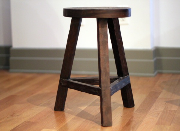

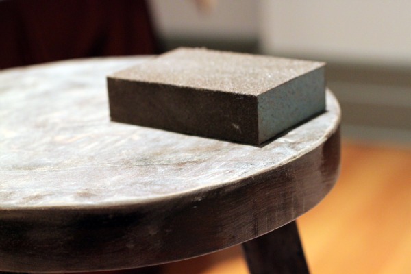
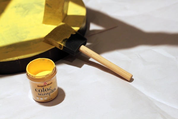
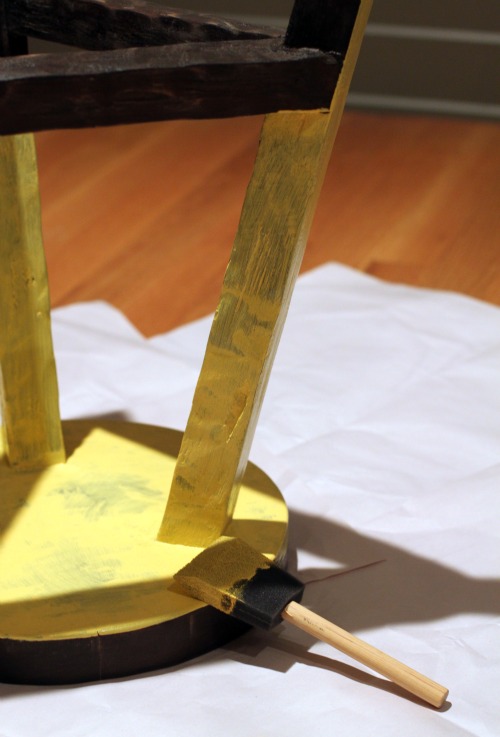


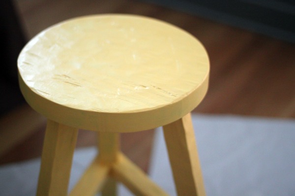 Three coats later, she's shaping up nicely. There's still a few dark places I'd like to cover, so it looks like she'll be gettin' one more coat tonight. And for the record, it's been a fun being temporarily crafty. But I won't lie: I am still undecided whether this freshened-up piece of my apartment is looks chic, or if it just looks like it belongs in the designated children's area of a McDonald's restaurant. (French fries, anyone?)


 I picked this option in the end because it's interesting, a little unexpected, a bit off-center, and, if you could see my whole studio, it helps reinforce where the kitchen ends and the living room begins (always nice in a small space). I also like how it looks like it's trying to sneak a peek around the corner at the bookshelves.